HOMEPAGE
HOMEPAGE
DESIGN SNAPSHOT
DESIGN SNAPSHOT
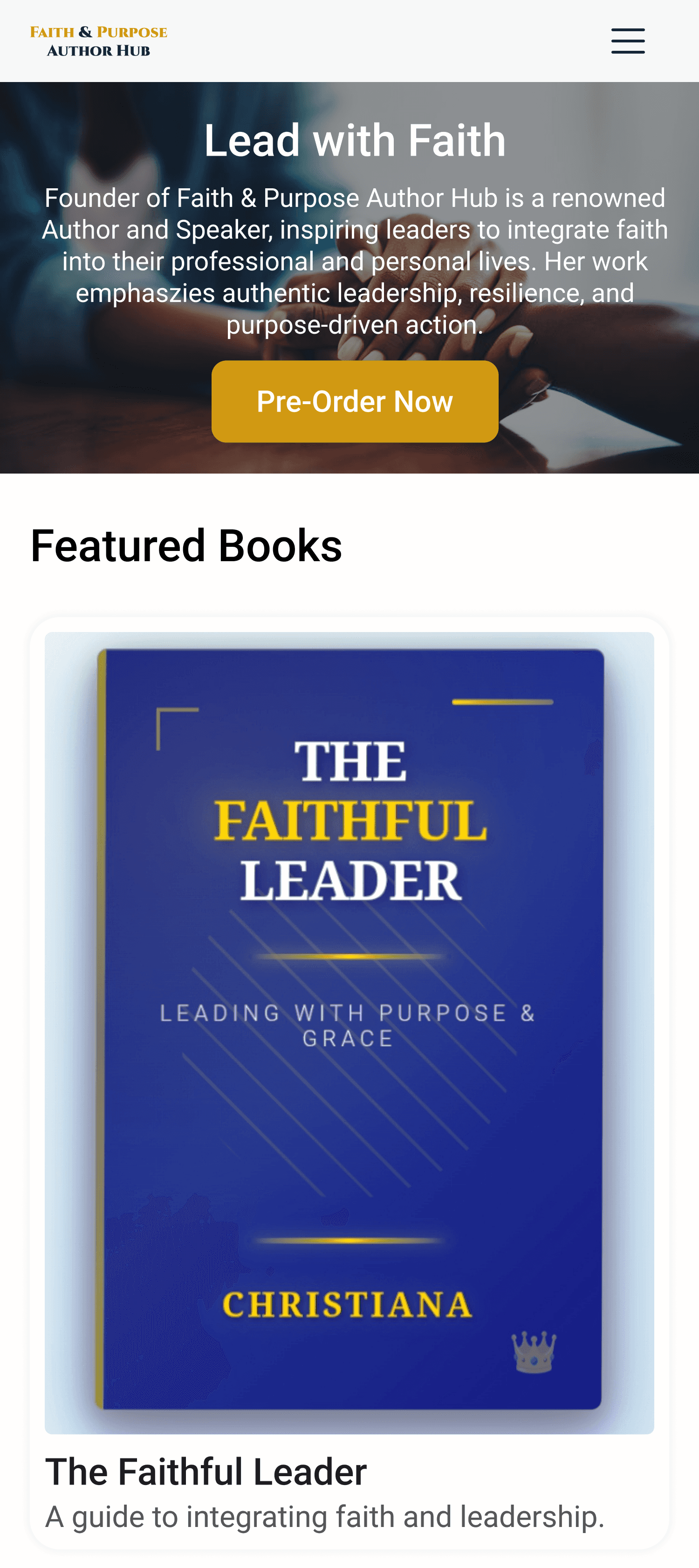
Faith & Purpose Author Hub
Faith & Purpose Author Hub
Responsive Web Design & Conversion Strategy Snapshot
Responsive Web Design & Conversion Strategy Snapshot
Role: Product & UI/UX Designer
Role: Product & UI/UX Designer
Role: Product & UI/UX Designer
Platform: Web & Mobile
Platform: Web & Mobile
Platform: Web & Mobile
Timeline: 4 Weeks
Timeline: 4 Weeks
Timeline: 4 Weeks
CORE OBJECTIVE
"To create a scalable, trust-centric digital home for faith-based authors that converts visitors into readers through clear hierarchy and practical navigation."
"To create a scalable, trust-centric digital home for faith-based authors that converts visitors into readers through clear hierarchy and practical navigation."
"To create a scalable, trust-centric digital home for faith-based authors that converts visitors into readers through clear hierarchy and practical navigation."
Layout Strategy
Layout Strategy
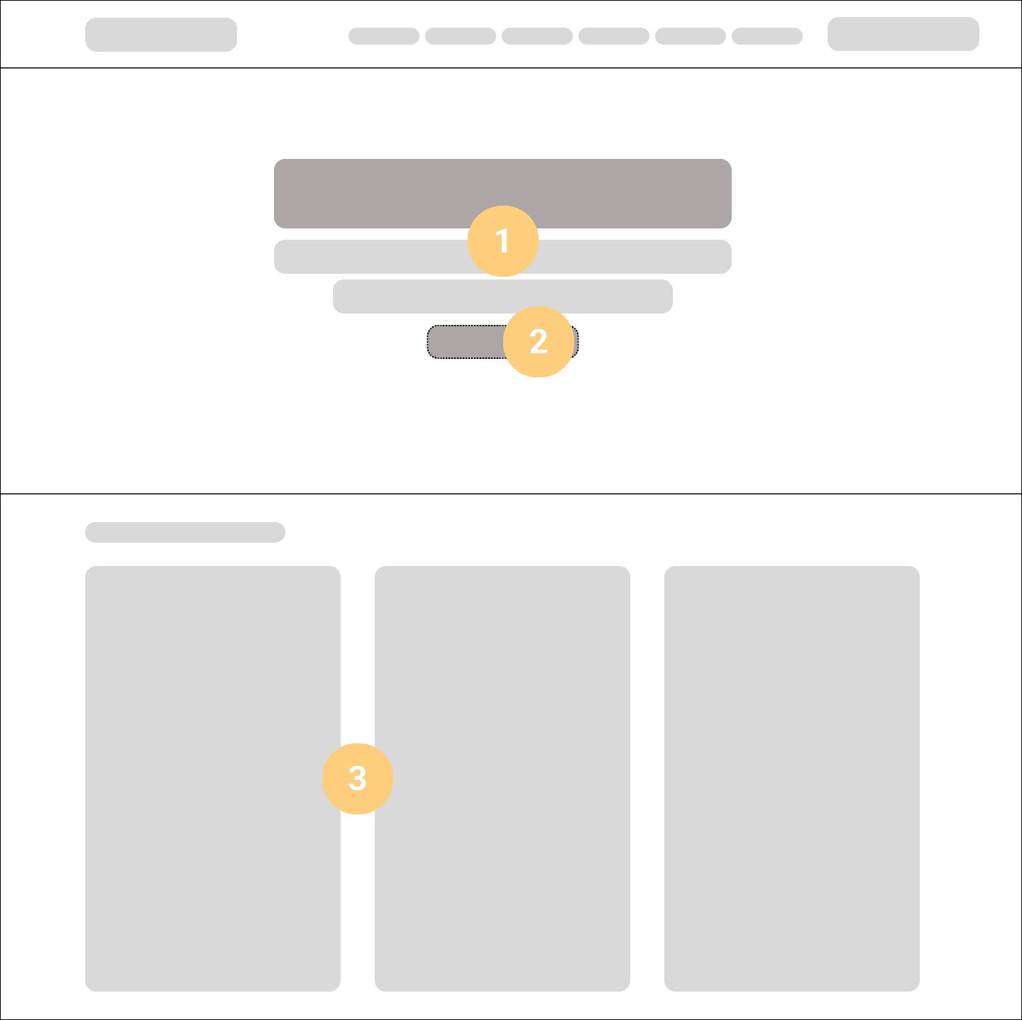
1
Trust-Building Hero
A focused hero section that clearly introduces the author and platform value in a single, uncluttered layout. The primary call-to-action is immediately visible, reducing hesitation and setting a clear next step for first-time visitors.
1
Trust-Building Hero
A focused hero section that clearly introduces the author and platform value in a single, uncluttered layout. The primary call-to-action is immediately visible, reducing hesitation and setting a clear next step for first-time visitors.
1
Trust-Building Hero
A focused hero section that clearly introduces the author and platform value in a single, uncluttered layout. The primary call-to-action is immediately visible, reducing hesitation and setting a clear next step for first-time visitors.
2
Conversion Path
Primary actions such as “Pre-Order Now” and “Subscribe Now” are placed consistently across key sections to remain accessible as users scroll. This ensures conversion opportunities are visible without interrupting content consumption.
2
Conversion Path
Primary actions such as “Pre-Order Now” and “Subscribe Now” are placed consistently across key sections to remain accessible as users scroll. This ensures conversion opportunities are visible without interrupting content consumption.
2
Conversion Path
Primary actions such as “Pre-Order Now” and “Subscribe Now” are placed consistently across key sections to remain accessible as users scroll. This ensures conversion opportunities are visible without interrupting content consumption.
3
Content Discovery Funnel
A three-column grid groups books, resources, and author content into clear categories early in the journey. This structure reduces cognitive load and helps users quickly understand what is available and where to go next.
3
Content Discovery Funnel
A three-column grid groups books, resources, and author content into clear categories early in the journey. This structure reduces cognitive load and helps users quickly understand what is available and where to go next.
3
Content Discovery Funnel
A three-column grid groups books, resources, and author content into clear categories early in the journey. This structure reduces cognitive load and helps users quickly understand what is available and where to go next.
Responsive Behavior
Responsive Behavior
Mobile View
Mobile View
Single-column vertical stacking for all content modules.
Hamburger menu replaces top navigation
Touch-friendly tap targets (min 44px)

Desktop View
Desktop View
Multi-column grid utilizing full screen width
Mega-menu navigation for deeper content access.
Hover state for interactive elements.